TEAM
Product manager
UX designer( ME )
4 Engineers
MY ROLE
Behavioral Research
Conceptualization
Design
Usability testing
Competitive analysis
Dev handoff
DURATION
2 Months
Imagine being a traveler or someone who loves discovering new places.
Our Frens engagement analysis report for December 2024, compared to January 2025, revealed a noticeable decline in both daily engagement and the number of posts.
To address these challenges, I explore a range of UX frameworks, working closely with the analytics team to uncover key insights through Geospatial Engagement Analysis.
40%
30%
Frens is a travel companion app designed to help travelers connect with others while providing real-time information like local events, weather updates, and travel tips.
THE PROBLEM
As a user of Frens, a location-based platform, you’re first greeted with content tailored to your current location. However, this can sometimes lead to a sense of disconnection, especially if you're in an area where few people are using the platform. Without active conversations or a vibrant community in your immediate vicinity, it becomes harder to engage and feel connected.
This lack of engagement in specific regions led users to feel isolated from the broader platform community, limiting their ability to fully participate. As a result, many users posted less frequently, unsure of how to spark conversations or boost engagement in their regions. This challenge highlighted a crucial opportunity: how can we foster a more connected experience for users, regardless of their location?
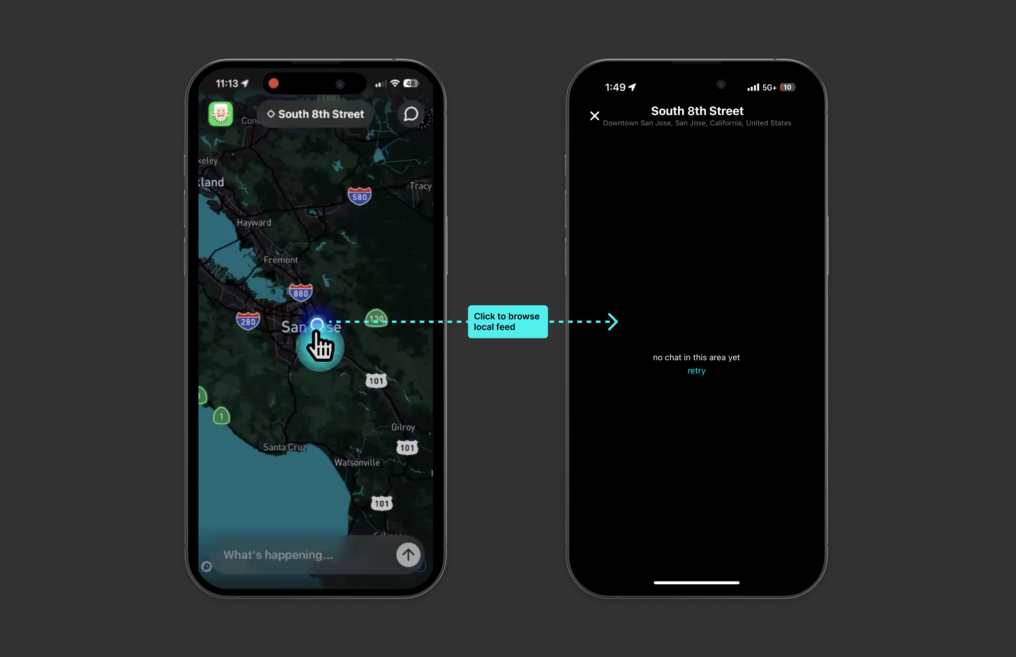
The current location in San Jose, CA, with low engagement and no content.
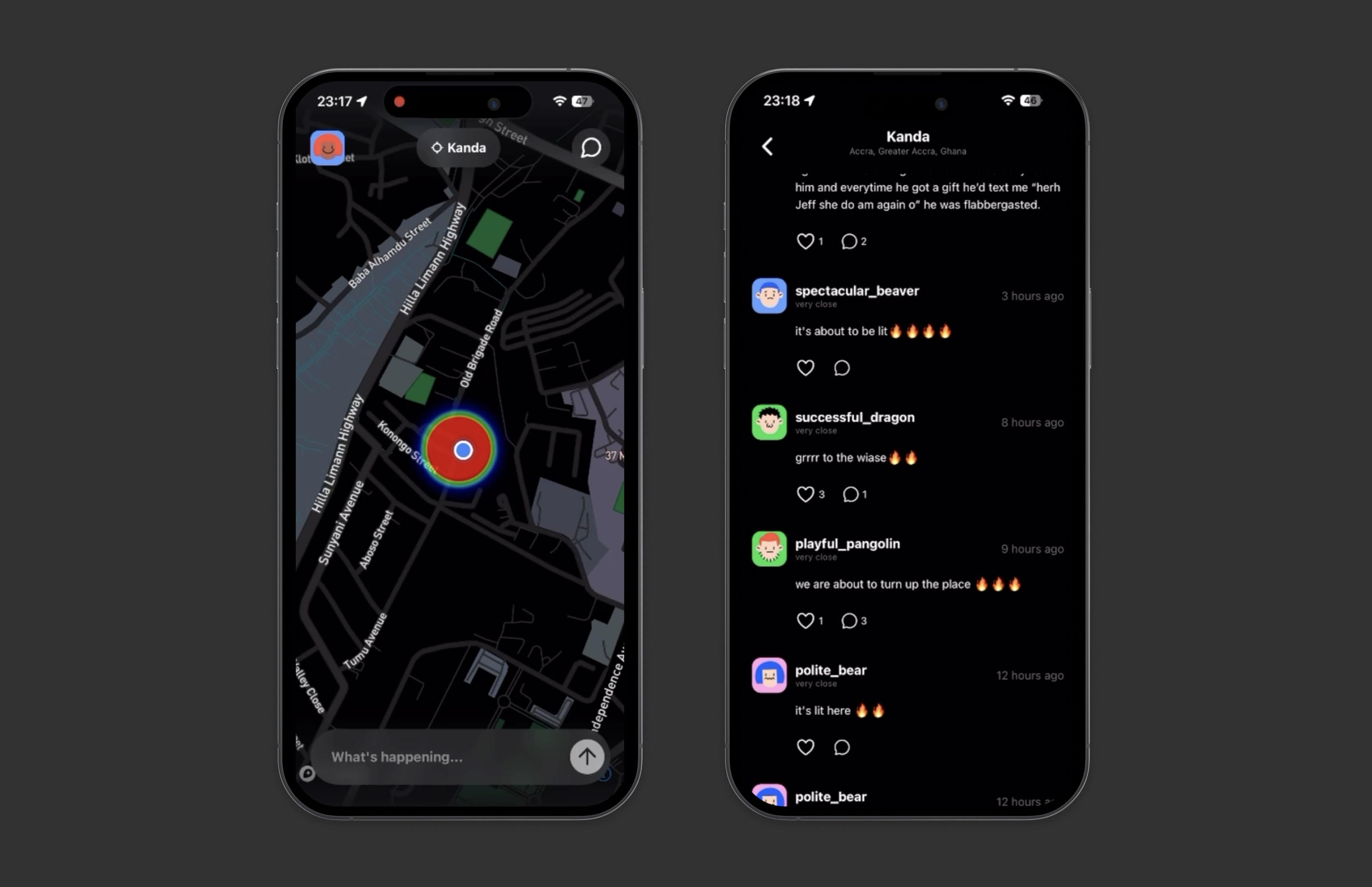
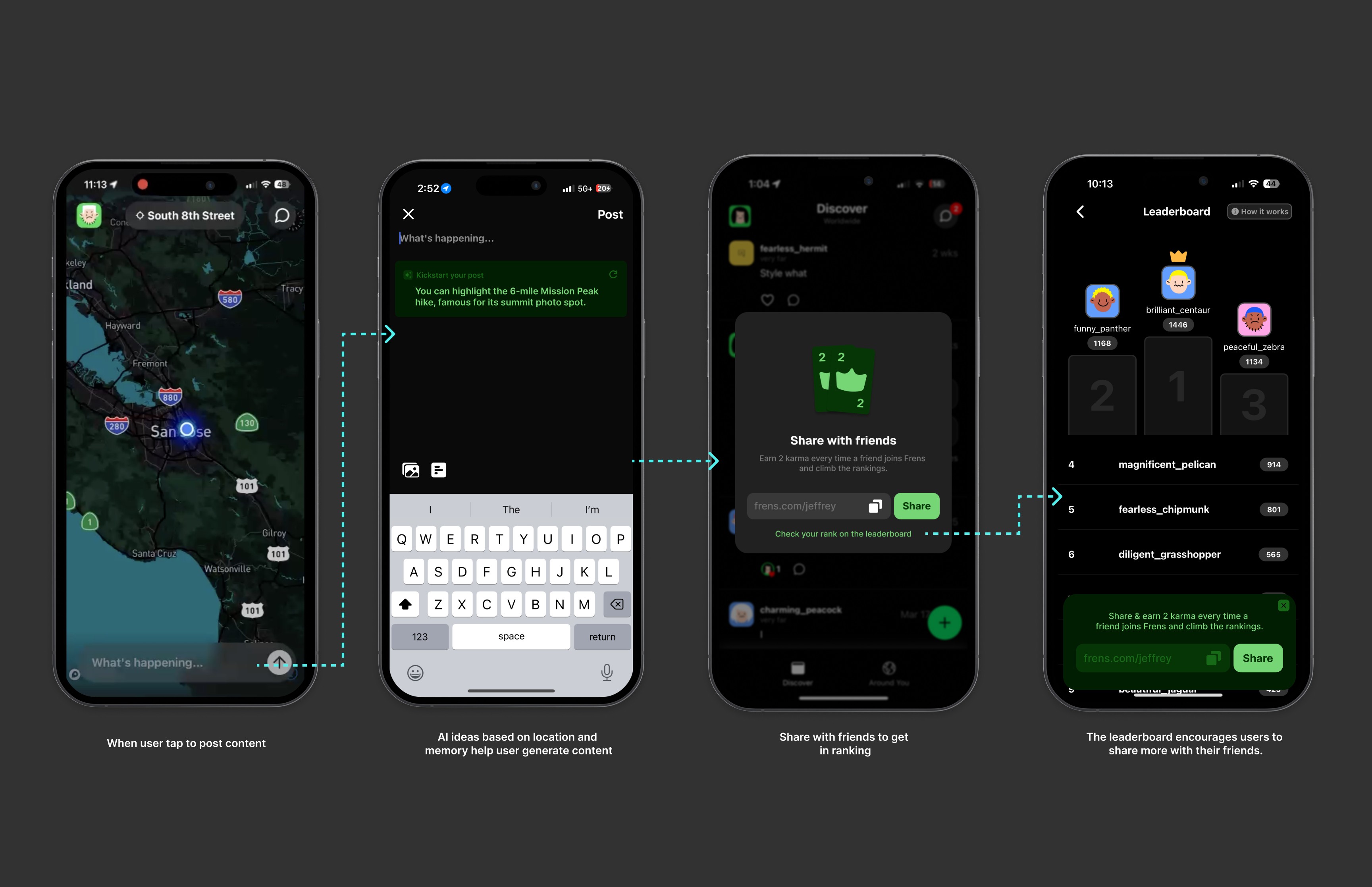
When a user posts content in a region, both during and after the posting process.
UNDERSTANDING THE SPACE
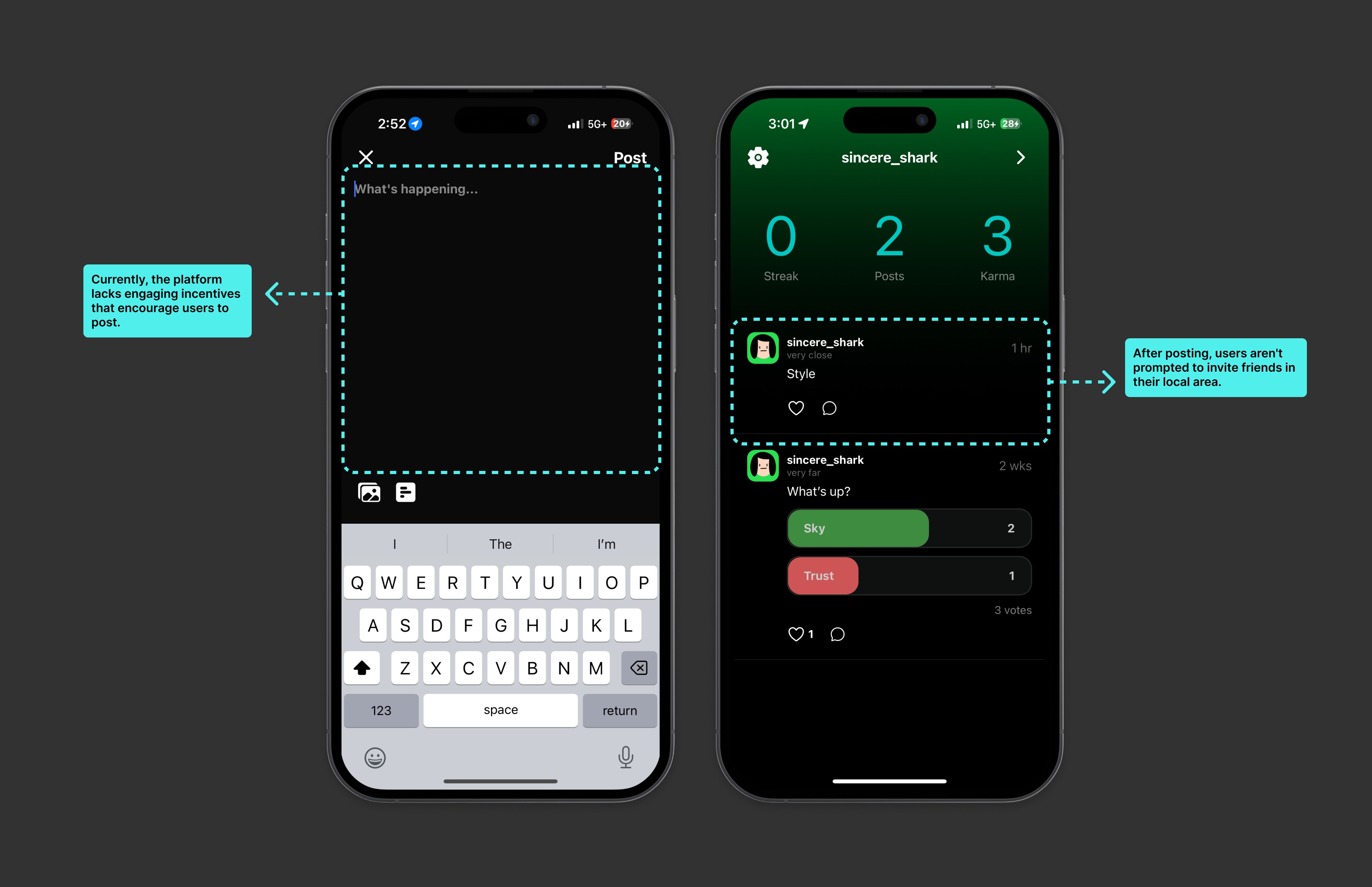
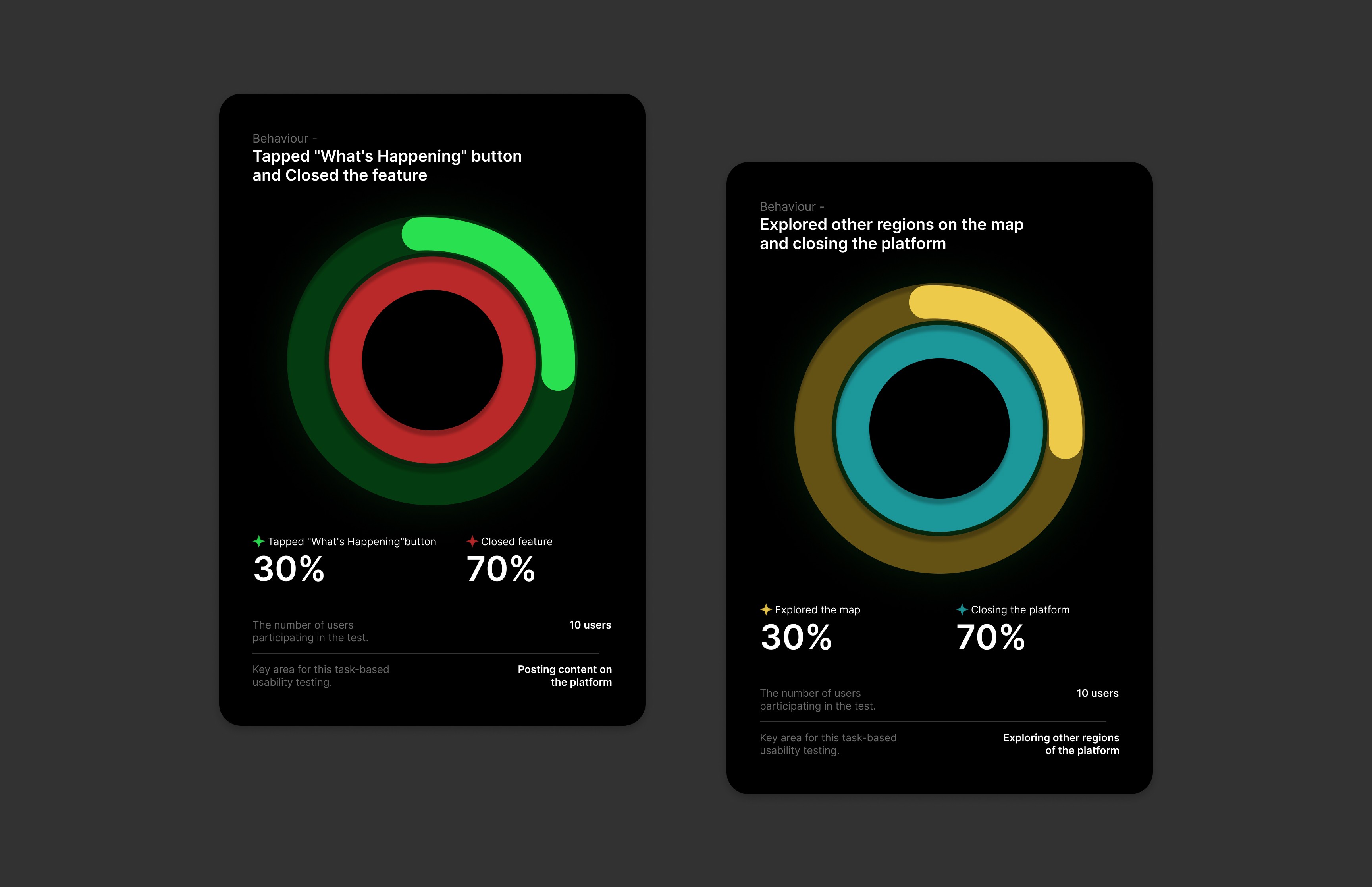
I conducted task-based usability testing with 10 users, asking them to post content and explore other regions. 7 out of 10 tapped the "What's Happening" button but quickly closed it, while 3 navigated the map to explore other regions. The rest closed the app, unable to find engaging content, revealing a clear need to improve cross-region interaction and engagement.
SOLUTION
To address the drop in engagement, I designed a feature that gently prompts users with AI-generated content ideas and encourages them to invite friends, paired with a karma-based leaderboard that rewards sharing.
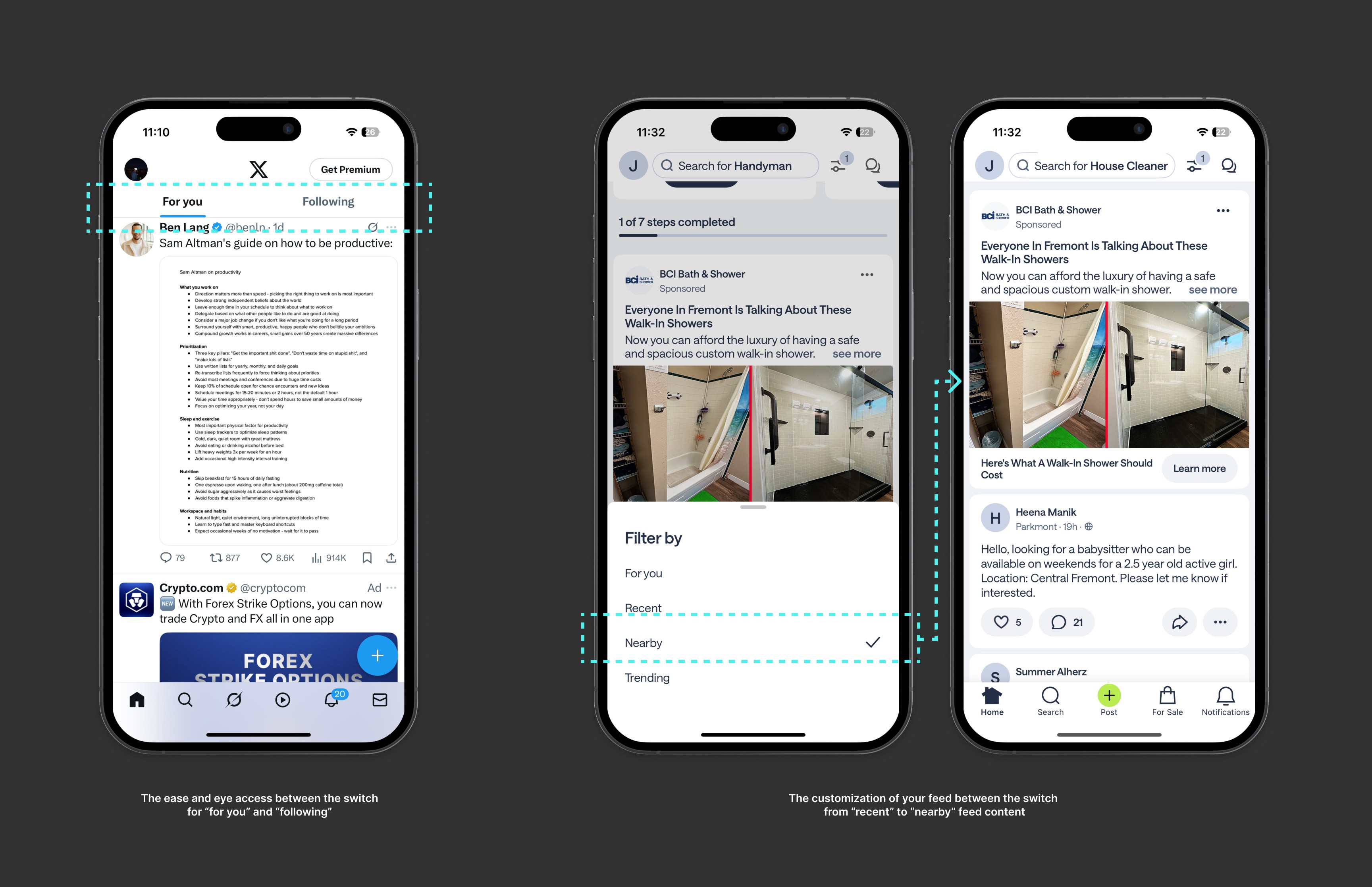
Inspired by platforms like X and Nextdoor, I explored how giving users control over their feed, like switching between “Nearby” and “For You,” could reduce drop-offs and keep them engaged, even when local content is sparse.
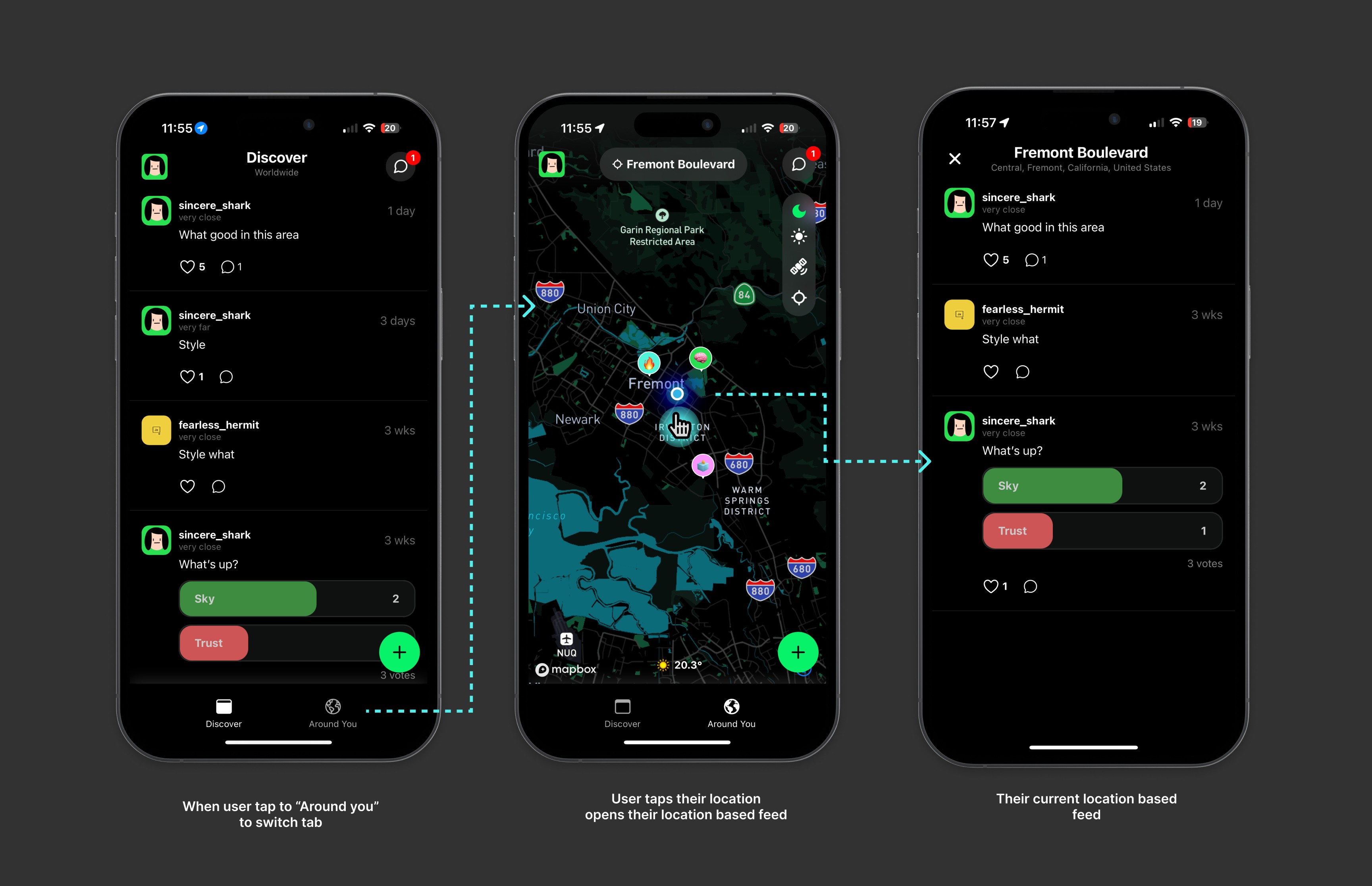
To reduce early drop-off and make local areas feel more alive, I introduced a location-based feed that lets users see and interact with nearby posts, even through simple polls or replies. This encourages small interactions that can grow into meaningful local conversations
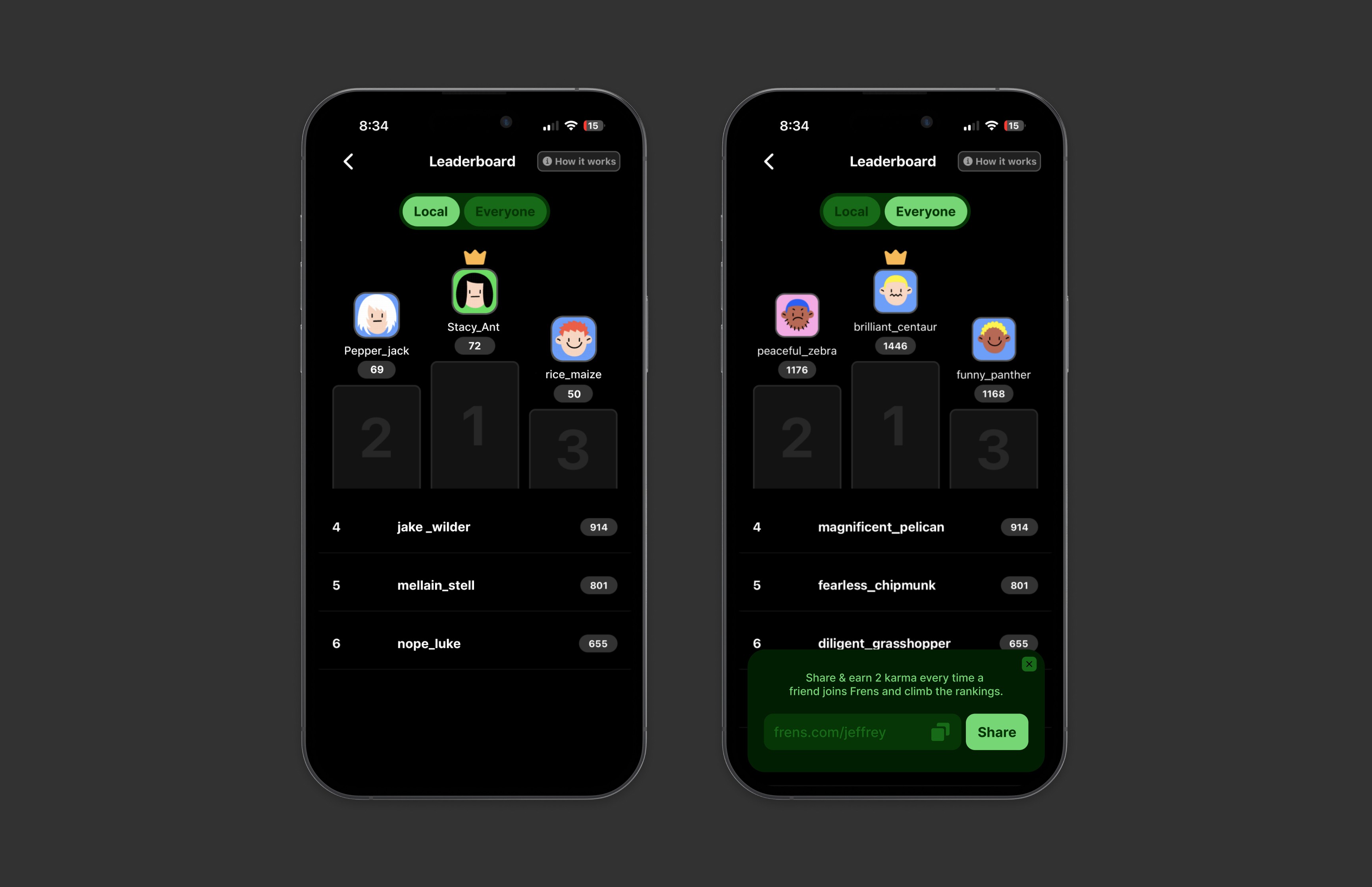
To make the leaderboard more approachable, I added a “Local” tab to highlight nearby rankings. This helped users feel recognized in smaller circles and less discouraged by the global competition.
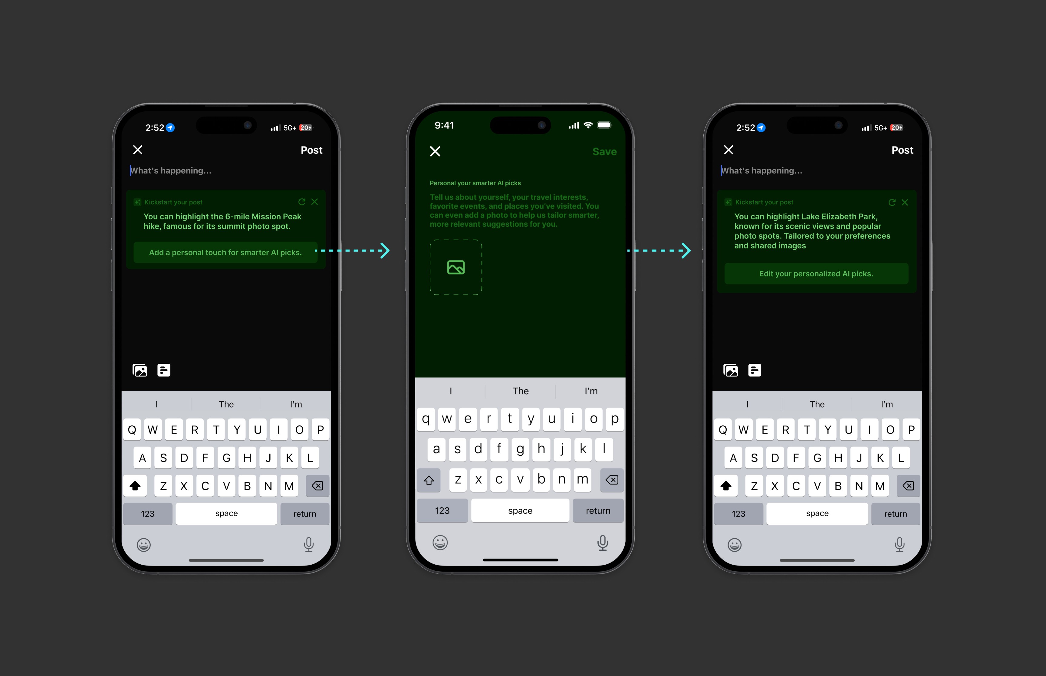
To address feedback that AI suggestions felt too generic, I added a lightweight personalization flow. Users can now guide the AI by sharing their interests and photos, making the recommendations feel more tailored and relevant.
After deploying the solution, the impact was immediately noticeable:
30%
60%
Increase in the daily number of posts on the platform as users began interacting more.
Signing off
This project was an incredibly rewarding experience. The key lessons I learned were:
Putting the user at the center of the design process is essential. Testing and iterating based on real user feedback allowed me to craft a solution that truly met their needs.
Design solutions evolve over time. Continuous testing and feedback are crucial to ensuring that the final product resonates with users.
Small design changes, like the introduction of icons instead of heat maps and AI-powered prompts, can significantly increase user interaction and engagement.
This case study illustrates how user feedback and testing shaped the design of Frens, leading to increased engagement and a more unified global experience. Through a thoughtful iterative process, I was able to address user pain points and deliver a solution that enhanced the overall user experience.
By focusing on user needs and continuously refining the design, we were able to make a measurable impact and create a more connected and engaging platform for travelers.