POWERSHOP

TEAM
Product manager
UX designer ( ME )
3 Engineers
MY ROLE
Qualitative Research
Behavioral Research
Conceptualization
Design
Usability testing
Dev handoff
DURATION
4 Months
Imagine being a creator, trying to set up your online store, and facing countless constraints just to add products and get everything up and running.
Beta testing revealed 80% of creators abandoned the product addition process with feedback like, “I don’t know where to start” and “It’s too much information.” Users were overwhelmed by unclear instructions and too many options, especially when managing descriptions, pricing, and choosing between affiliate vs. own products. This highlighted the need to simplify and streamline the flow to improve user engagement.

After implementing the new product addition flow, the platform’s analytics showed a significant improvement in user engagement.
70%
As part of this project, I also redesigned the platform to reflect its current form, as shown in this case study.
30%
As part of this project, I also redesigned the platform to reflect its current form, as shown in this case study.
85%
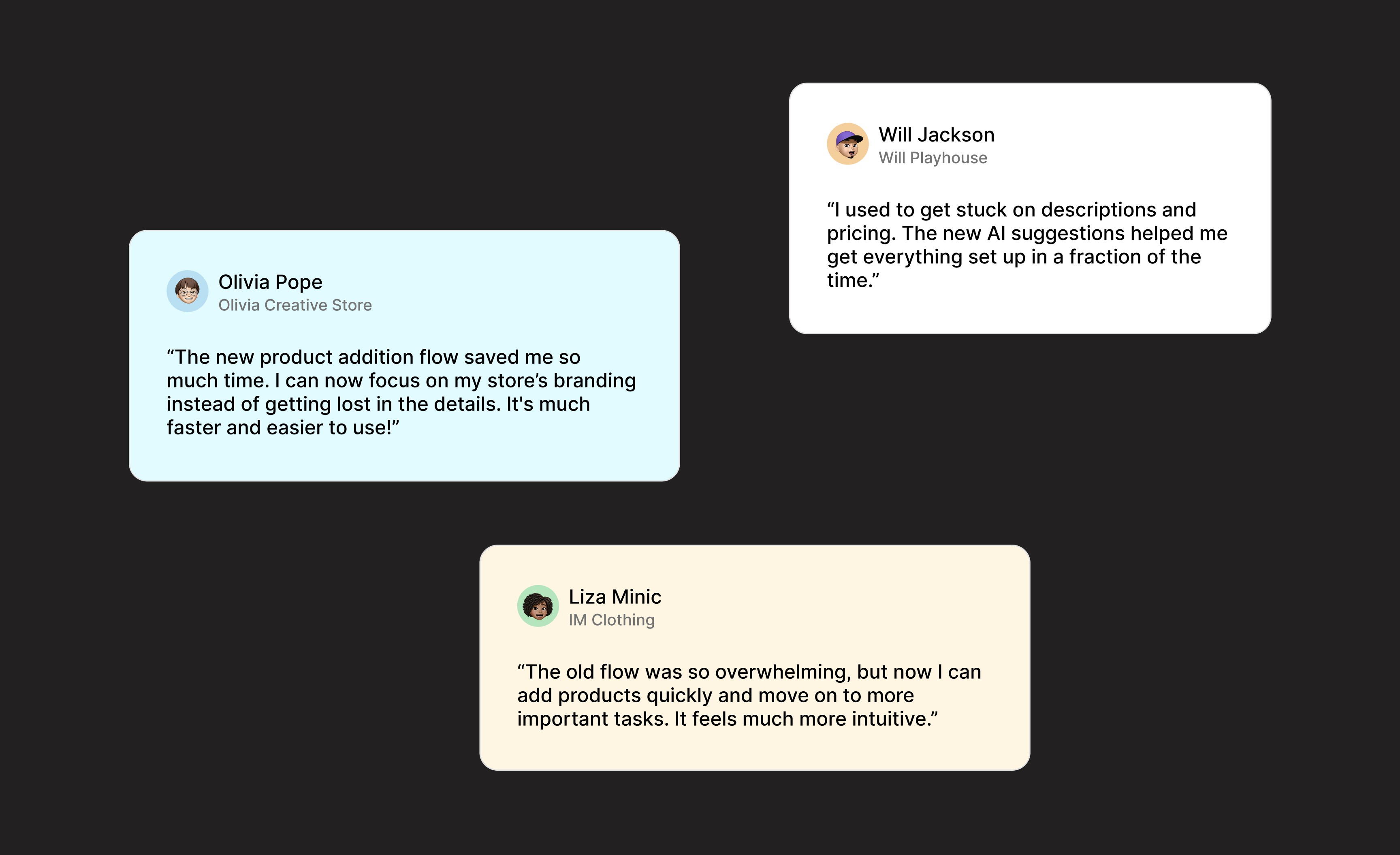
of creators reported the new flow made the product addition process "faster and less frustrating backed by user surveys
PowerShop is a web app that enables creators to quickly set up their own store and start selling their products or those from other merchants, all while aligning with the creator's mission.
Previous homepage of the web app
THE PROBLEM
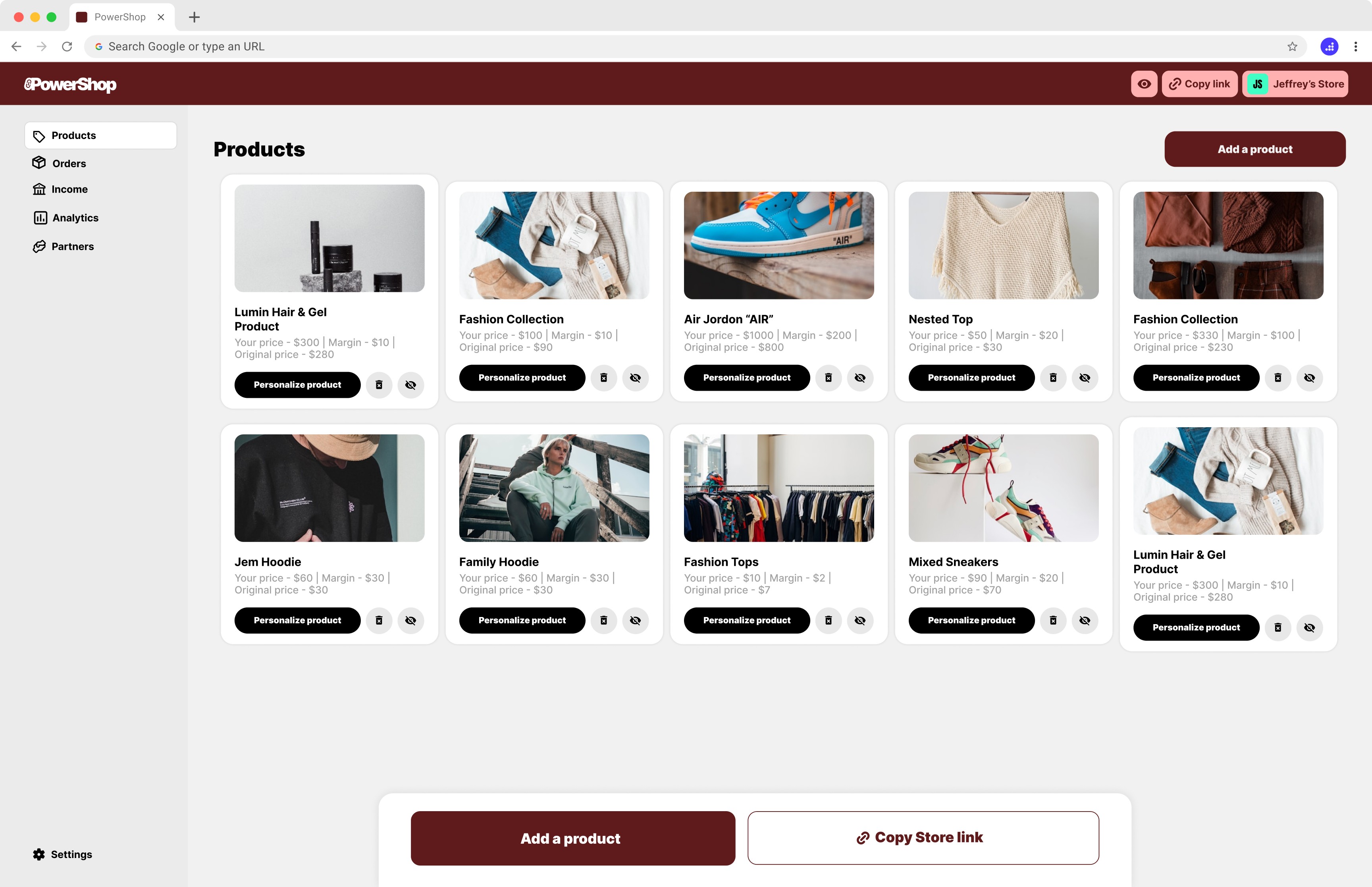
The experience of adding a product was getting overwhelming — creators didn’t know where to begin, struggled with too many options, and were confused by the choice between product types, and discouraged by the lengthy process of adding their "own products". The complexity created friction at the very first step, stopping creators from turning their vision into a reality.
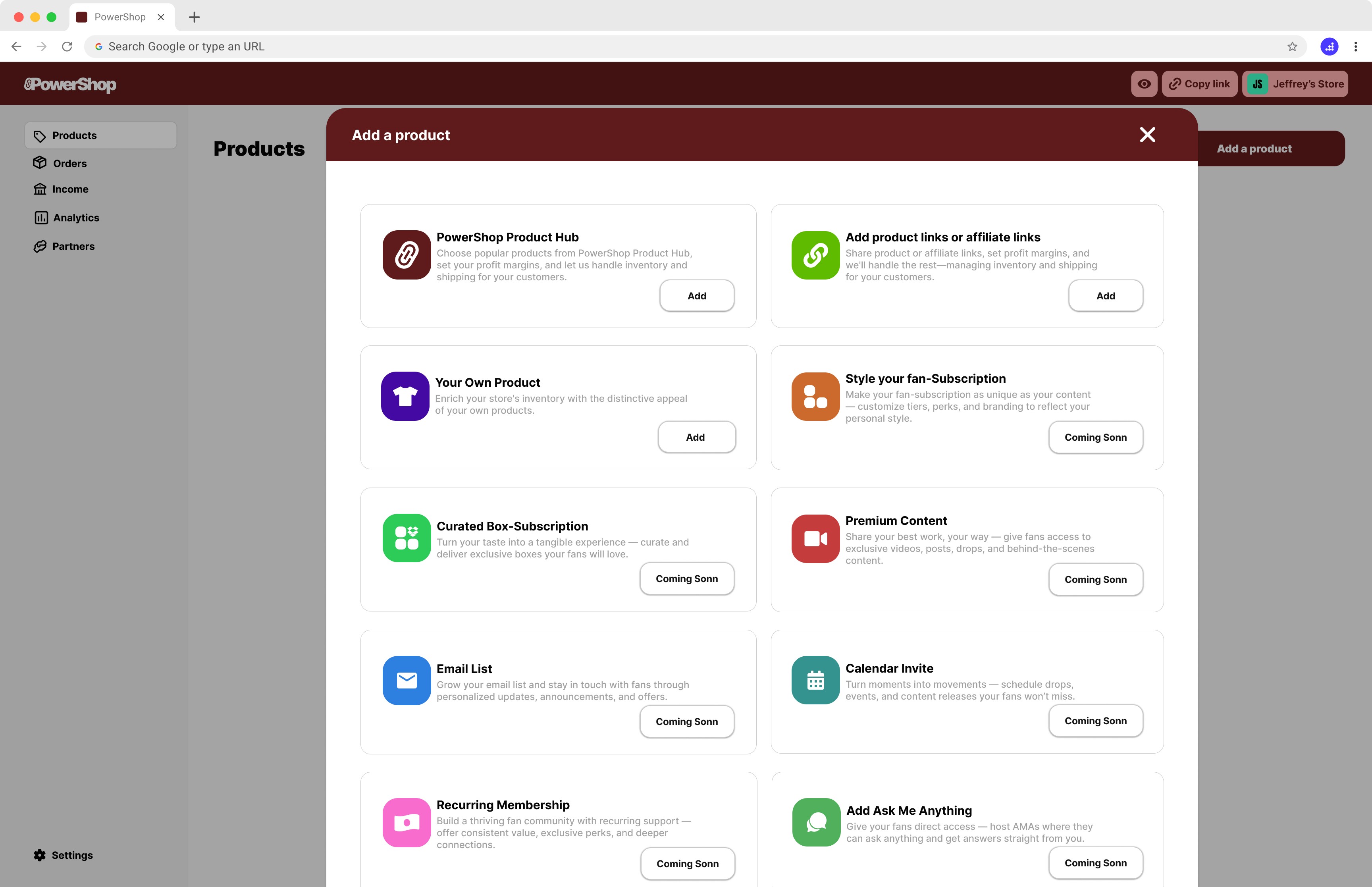
Add a product pop-up
I started with a question: Why are creators dropping off before launching their store?
To find out, I interviewed 7 users, each with their own struggles and stories. I watched how they interacted with the product — where they hesitated, where they got stuck, and where they gave up. I dug into our own user flows to spot the friction and compared our approach to others in the space.
Piece by piece, the picture became clear. And with that insight, I refined the experience — removing confusion, simplifying steps, and guiding creators more intuitively. The result? A smoother path forward, and a real win for our users.
Understanding the Space
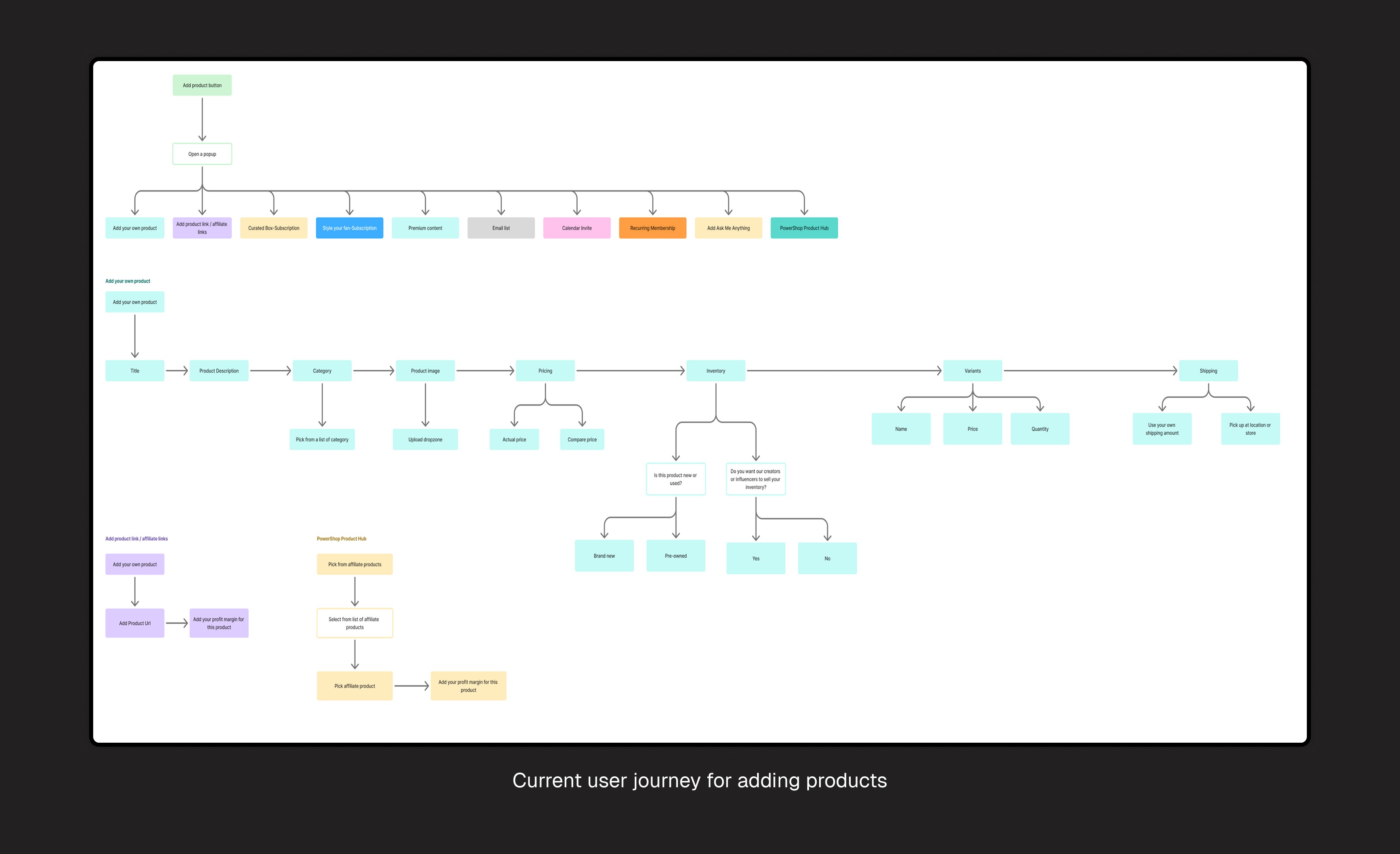
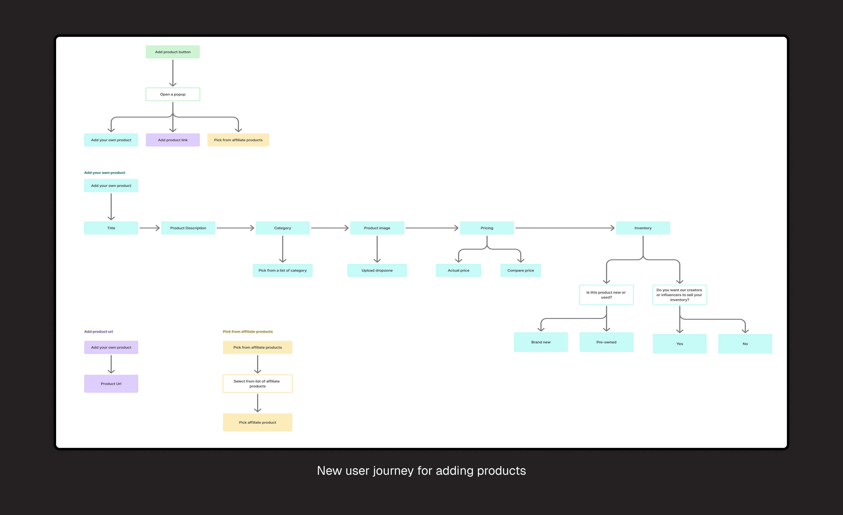
The original 'Add Product' flow was complicated, and the pop-up format led to confusion and abandonment. By analyzing where users dropped off, we were able to simplify the process. In the next section, we’ll show the before-and-after flow, highlighting how the redesign made the process more intuitive.
I researched platforms like Shopify, which simplified product setup with a one-step process, using AI to auto-fill details and speed things up. While this was effective in speeding up the process, PowerShop took a more personalized approach.
Offers AI recommendations tailored to the creator’s store, suggesting relevant product categories and prices. This helps users make faster, more accurate decisions, and focus on their brand.
Redesigned Add Product Flow
While exploring how users add products via custom creation, URL input, or affiliate selection, I noticed they all began the same way: with a topic and a few core details. So I redesigned the flow to start there. Instead of choosing a method first, users simply enter the product topic. Then, they pick how they want to add their "own product", product URL, or affiliate products.
To address high abandonment from the original 'Add Product' pop-up and frustrations from power users, I introduced a dual-path system: users can either start with a quick entry (topic and details) or directly choose their preferred method (custom product, URL, affiliate). By giving users more control upfront while keeping the flow flexible, the new design aims to reduce cognitive friction, better support different user needs, and lower the drop-off rate.
Although the Picture AI feature was removed, we integrated AI to auto-generate product descriptions and suggest prices. This saved creators time on manual tasks, letting them focus more on branding and less on data entry.
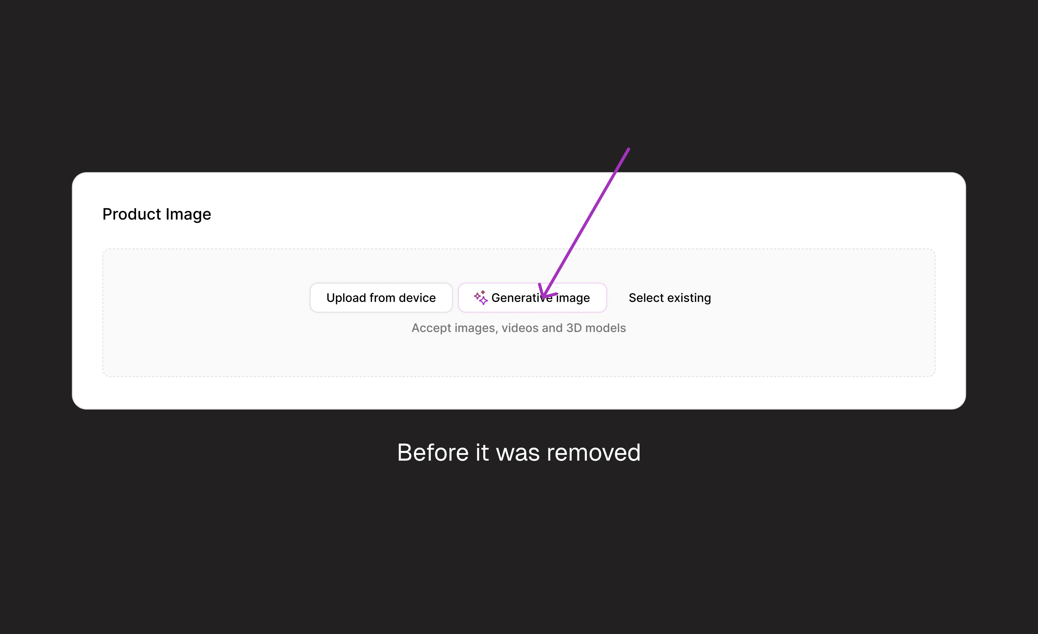

To reduce cognitive overload while still supporting flexibility, I introduced a guided step-by-step flow with progressive disclosure. Instead of showing all options upfront, I begin with a single, clear starting point, entering the product topic. From there, the system intelligently reveals relevant next steps based on user input. This balances simplicity for new users with efficiency for experienced ones,
Results and User Reactions
After the final design launch, user reactions were overwhelmingly positive. During follow-up interviews, we saw clear improvements in engagement metrics and user satisfaction.
Signing off
This project taught me to balance simplicity with functionality. Removing the AI feature was tough but helped me adapt to constraints. It emphasized the importance of early user testing and clear communication with stakeholders to reduce friction before development.
This involved many new elements, including Generative AI, a fast-paced field. Transitioning to AI research and learning to better assist my users was unfamiliar, but it taught me a great deal of solving problems differently
Throughout this project, analyzing my metrics and engaging directly with users impacted by the issue helped me uncover the root cause. I wouldn’t trade that experience for anything.